THE COMPANY AND THE CHALLENGE
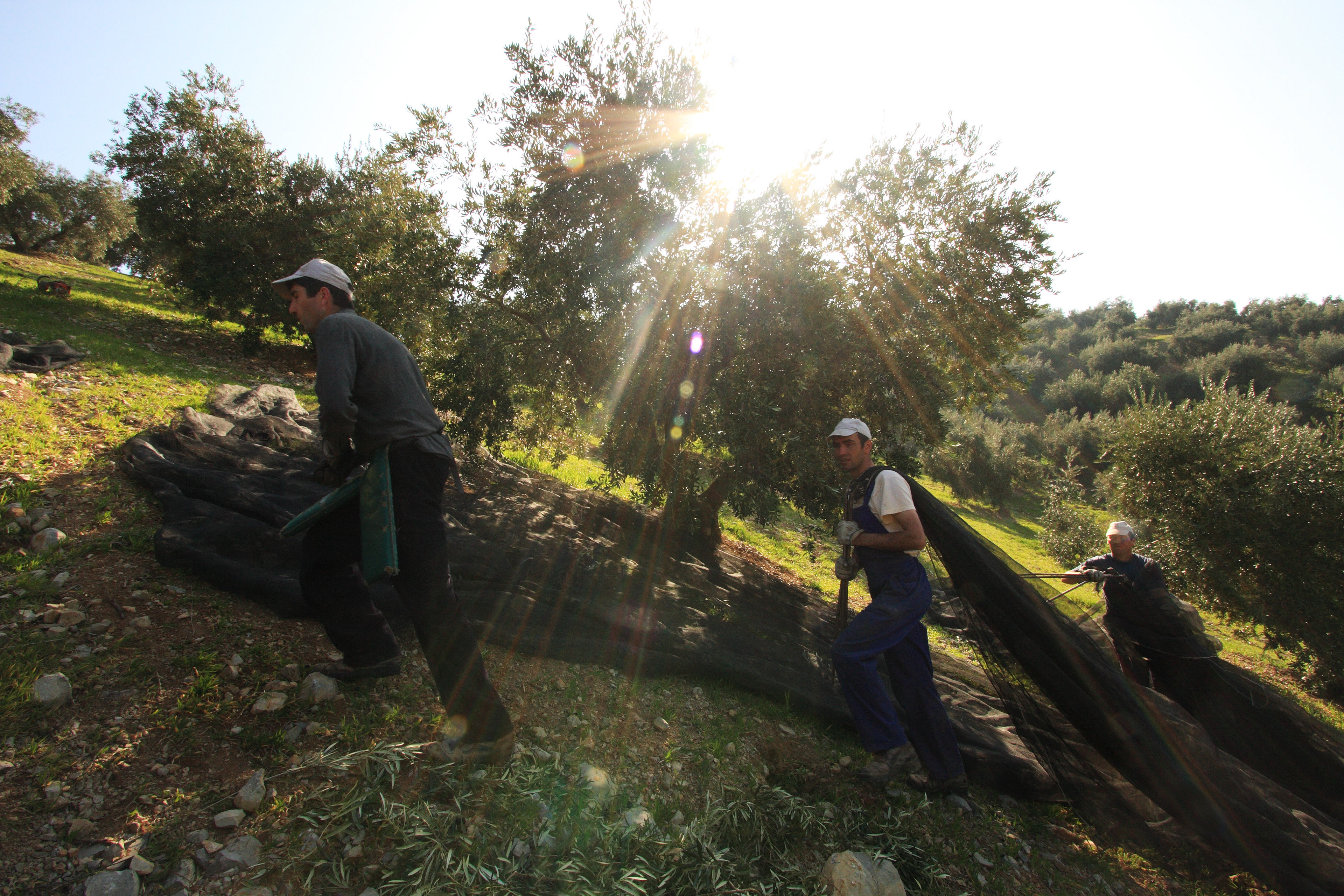
The Almazara de Muela company -meaning Muela Oil Mill- is a producer of quality olive oils distributed by Mueloliva y Minerva under different brands, including Mueloliva y Venta del Barón.
Only one brand is distributed directly by the producer under its name: Almazara de Muela.
Only one brand is distributed directly by the producer under its name: Almazara de Muela.
So far, this product was only available for direct sale in the shop of the factory. The Priego de Córdoba PDO extra virgin olive oil is dedicated to the farmers, mill masters, harvesters, the factory staff, and their families. As a result, it is sold at a very affordable price, offering an exceptional quality-price ratio.
Credit: Mueloliva
In order to honor and thank this big family of passionate workers, the company decided to invest in a new bottle design and widen the clientele by sharing this confidential reserve through the company's e-commerce site (a direct selling now accessible to all).
The challenge was to reveal the unique story of the brand through the creation of a new packaging including brand logo, bottle shape -that would be then used by the Mueloliva range too-, label design, and secondary packaging.
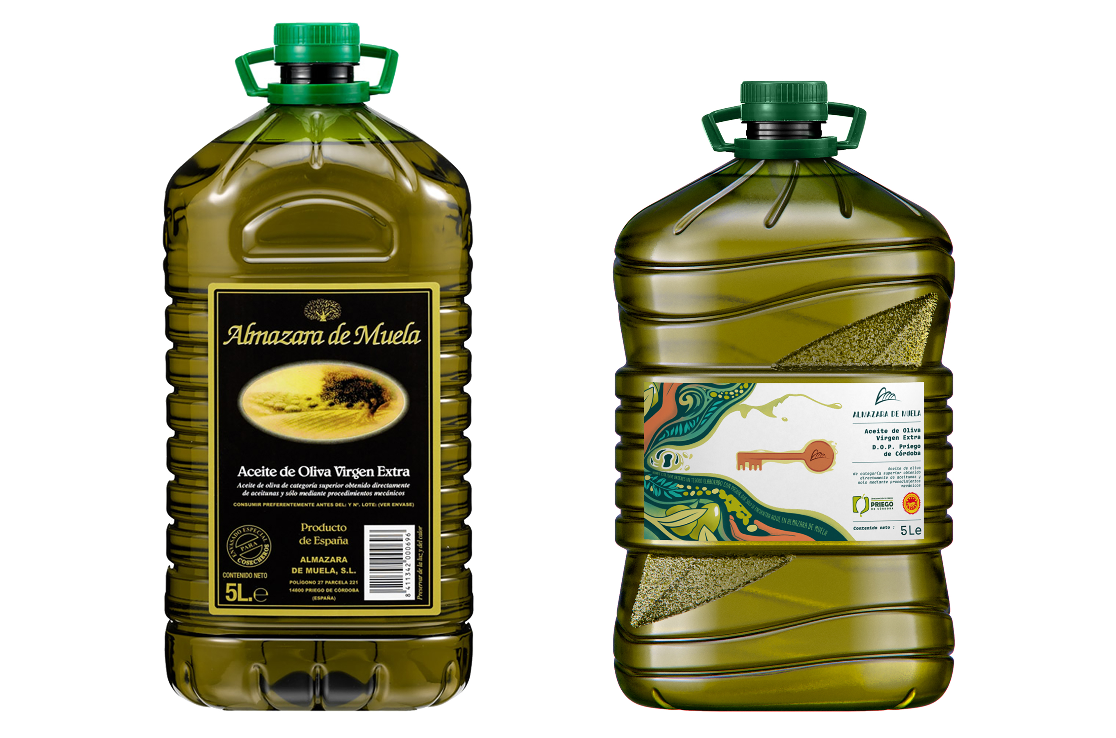
Before / After
The approach
Our strategy was to start redefining the brand’s positioning and rewrite its story, placing the workers at the heart of our approach.
The new design must definitively be more emotional to convey the beautiful story behind the product.
We proposed two concepts with several design routes.
The first concept was called 'Tribute', from which we proposed the 'celebration' design route, composed by cheerful and colorful illustrations, and a more minimal design route named 'authenticity', which included very simple, innocent illustrations and very few colors.
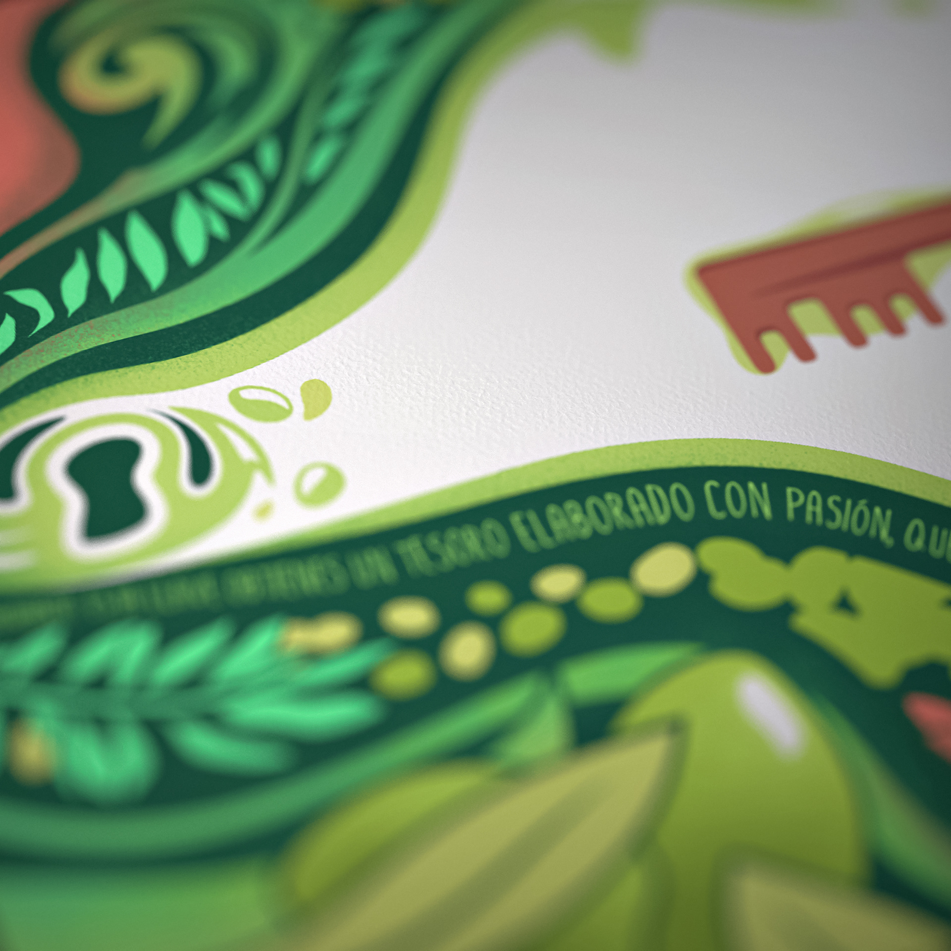
The second concept, which has been selected, was called 'Our secret': 'Farmers, harvesters, producers, office staff…all of us who are part of Almazara de Muela... share a secret'. It seemed then obvious to give life to this concept with a key.
Now let’s look at the bottle.
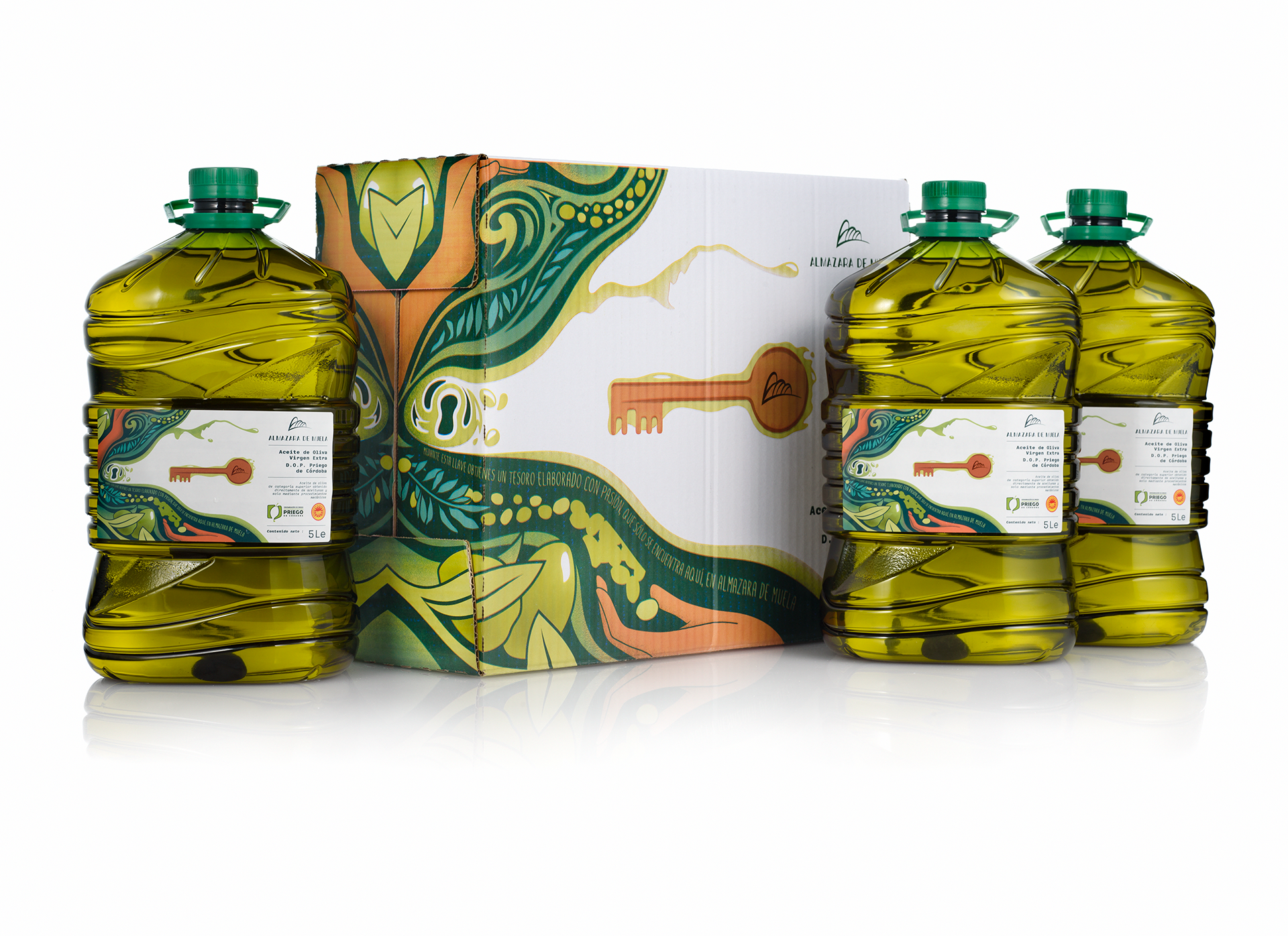
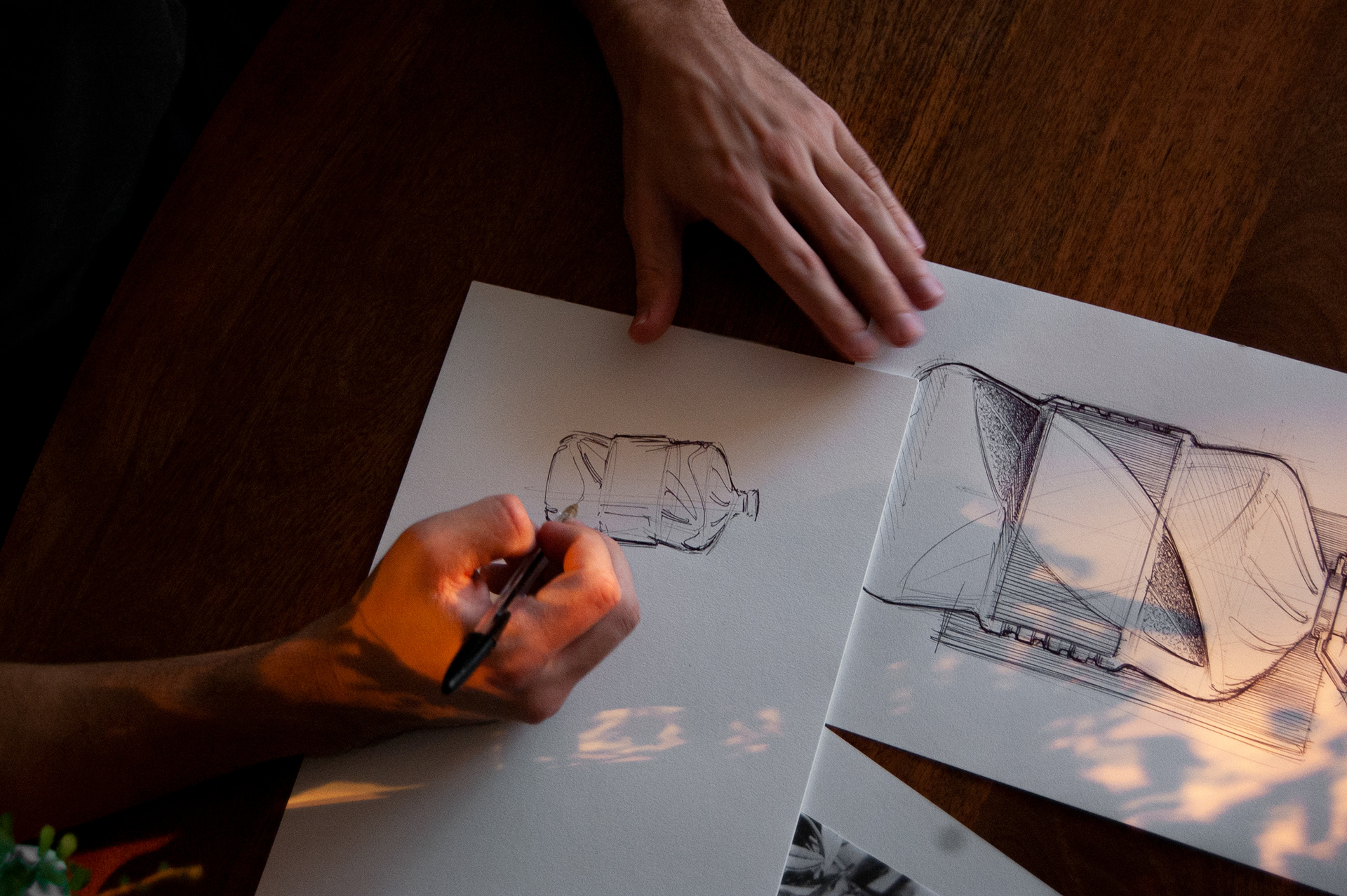
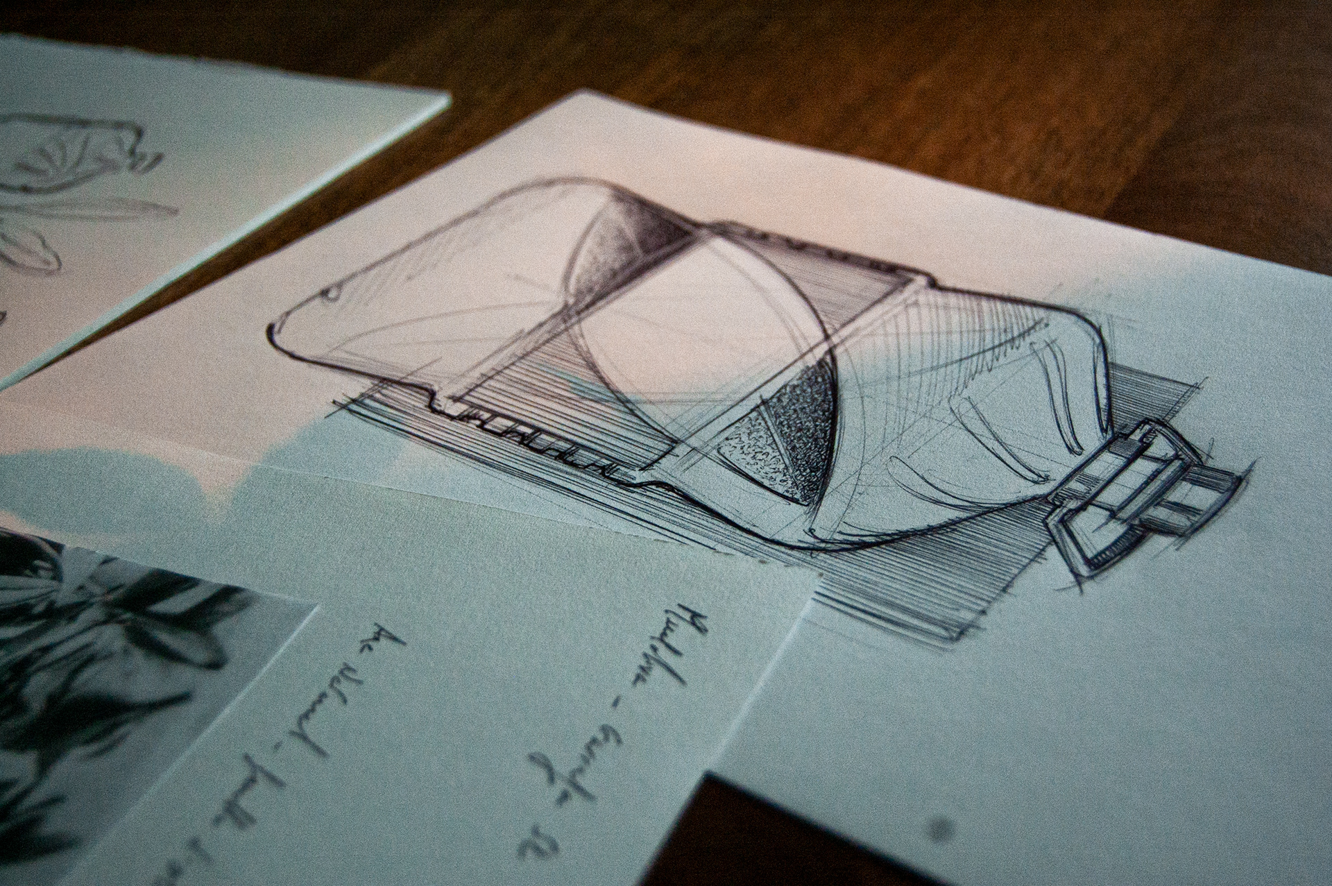
We had to create a 5L bottle. Larger capacity means more technical constraints. For example, the material is more stretched for this type of format, so we had to notably reinforce it with technical grooves. Thus, a close collaboration was carried out between the In Spirit Design team and the manufacturer to ensure the proper execution of the design, while respecting the material and weight constraints.
Other important parts to consider are the bottle functionalities (user-friendly design), aesthetics, and the emotional aspect. When creating this bottle that should fit all the Mueloliva’s range, we decided to keep the Mueloliva brand iconic olive tree leaf, already present on all the other bottle formats.
The result: The producers' secret
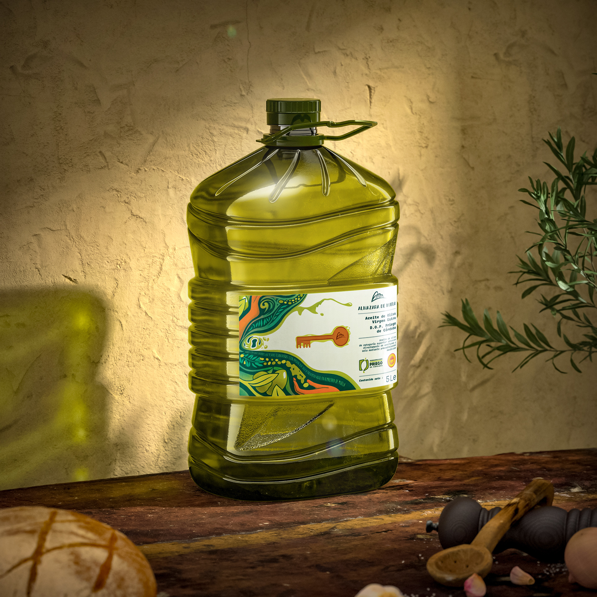
▶ The new, more modern & cheerful design pays tribute to the producers of Almazara de Muela and, at the same time, invites to discover their secret.
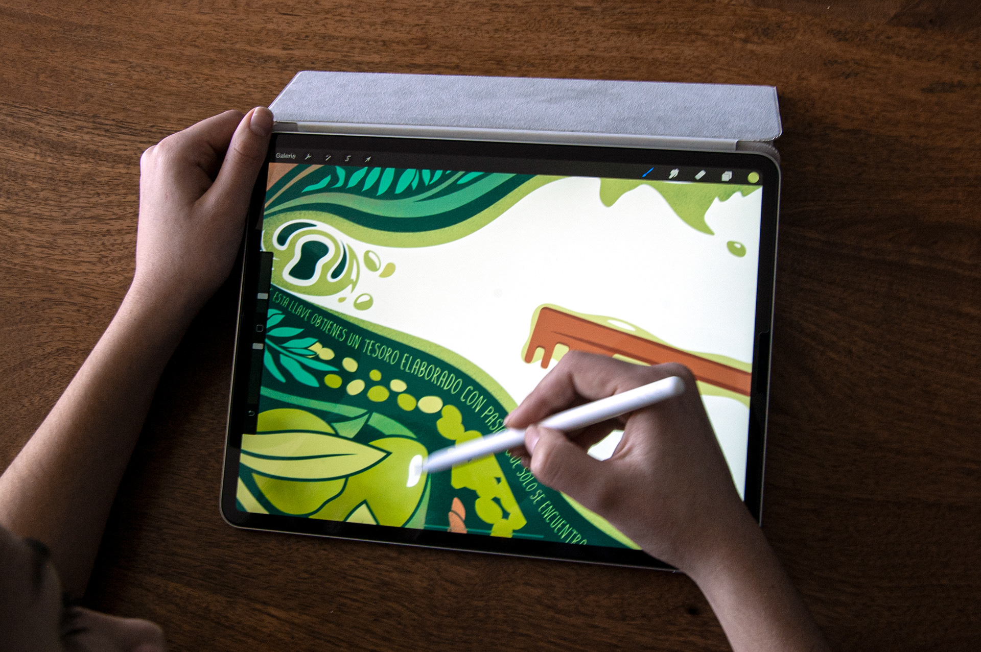
▶ The Almazara de Muela large family is proud and happy to share their secret symbolized by the key. The confidential oil, reserved for insiders, is now revealed to those who want to enter the Almazara de Muela world, represented in the label by a magical illustration.

We produce excellent olive oil, and we are happy and proud to share it with as many people as possible around the world.
However, there is one single product that we want to keep between us…
If you want it, we will not be able to deny it to you.
Nevertheless, you will need to deserve it!
You will only get it by being interested and curious about us and our secrets, since you will only be able to find it in a single place; in our Almazara.
▶ Like taken out from a fairy tale, the illustration mixes in a fluid way -representing the oil-, the careful labor of men and women with the natural elements and a message to the consumers.
▶ The brand's identity uses the AM initials to evoke the Priego de Córdoba mountainous landscapes adorned with vast rows of olive trees.
▶ The new exclusive 5L bottle highlights the naturalness of the product. We sculpted the shape with a large central olive leaf, sublimating the bottle while bringing several good gripping areas.
▶ Particular attention was paid to the grouping and transport cardboard box, which was also decorated with the brand's new visual identity.