
Centaine 100年润发
Brand strategy - Brand architecture - Packaging (shapes and labels)
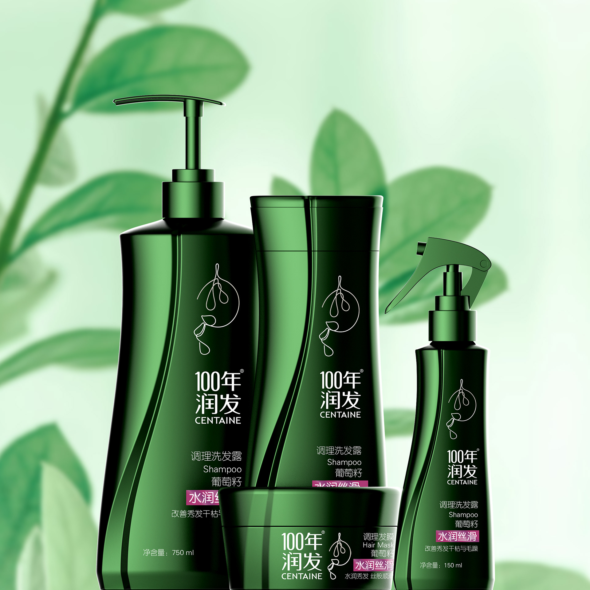
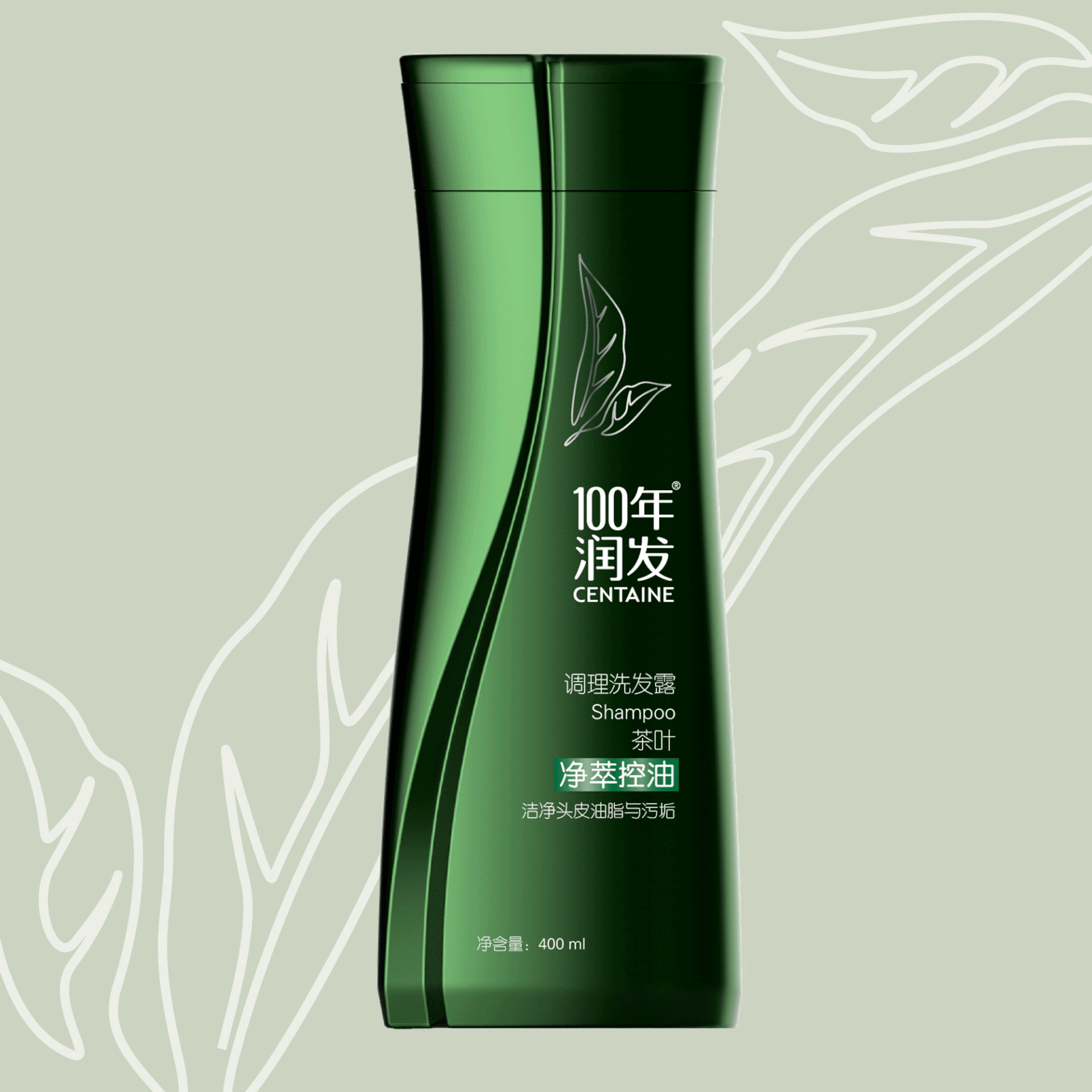
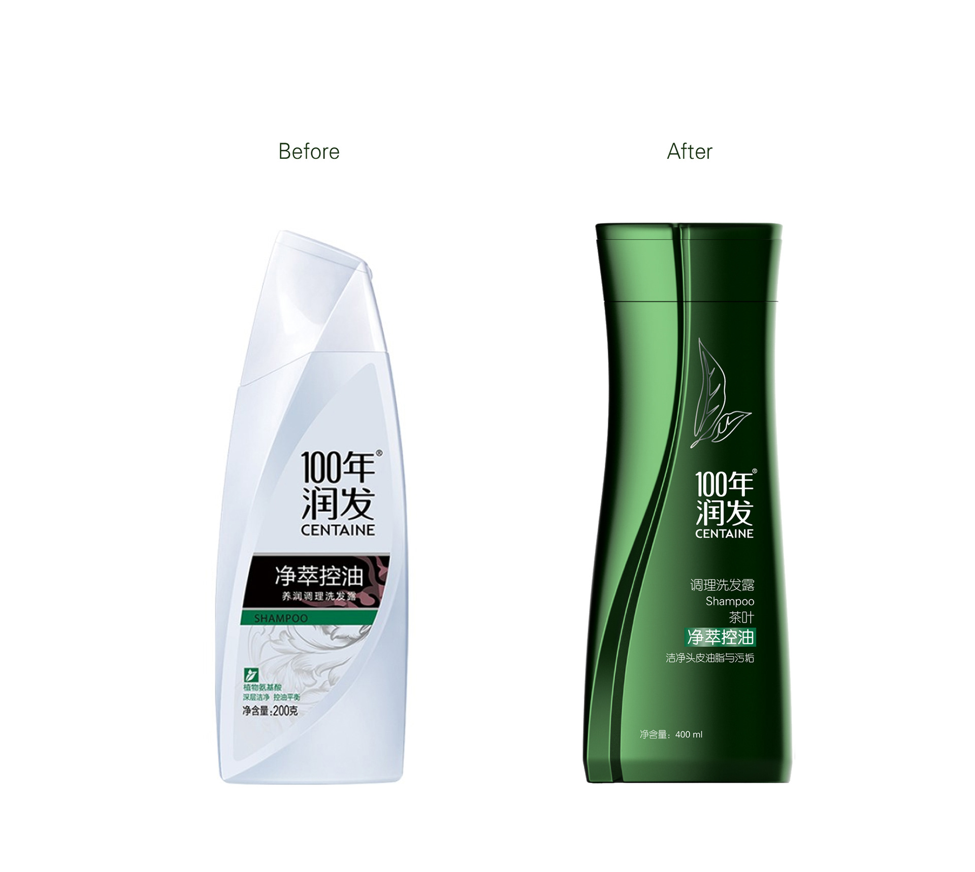
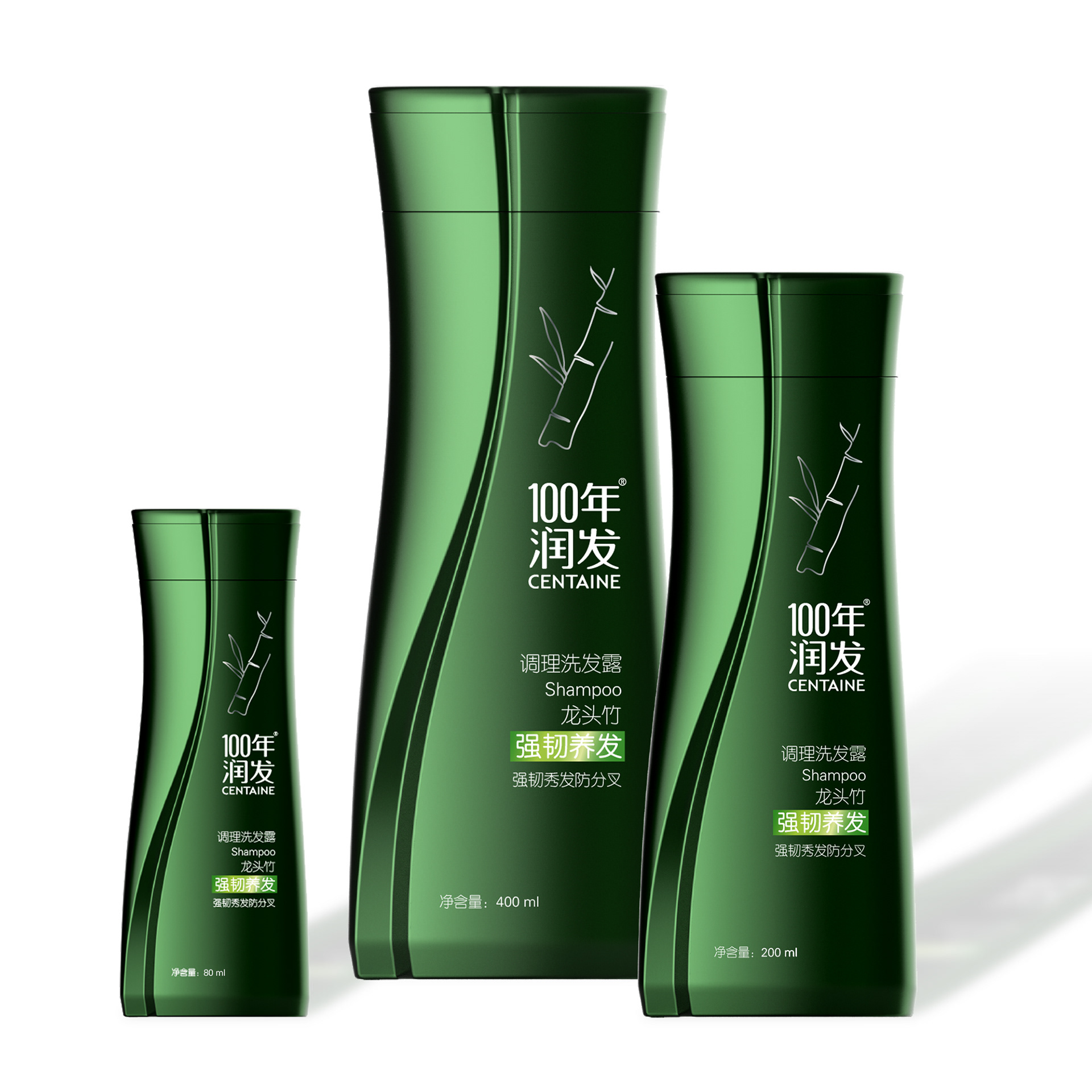
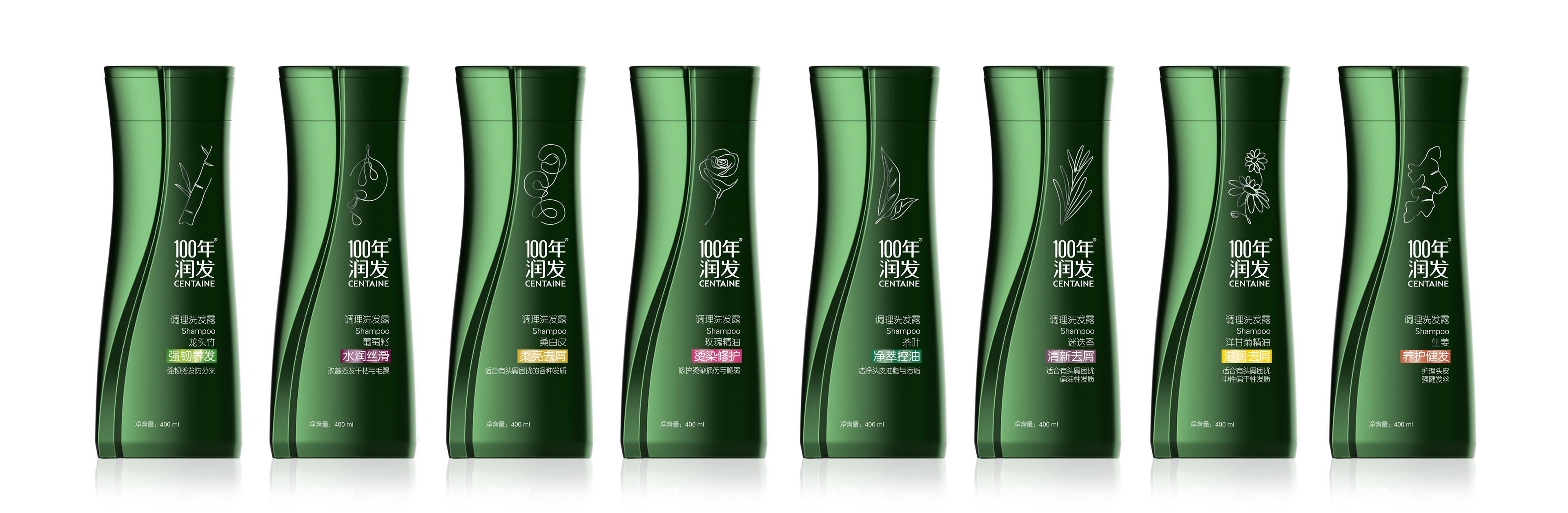
The new premium and iconic packaging, sold both in supermarkets & Centaine’s online shop, is to reflect the brand idea ‘vegetarian nutrition’, expressed here through the fluid and natural line that vertically crosses the shape from bottom to top. The line imitates a growing stem, absorbing nature’s essence to nourish the plant – just like Centaine’s ‘vegetarian nutrition’ to nourish the scalp and the hair.
The multiplication of packaging produces an oscillating rhythm on the shelves, which would create a strong shelf impact and gives a unique vitality to the range of products.
Next to the ‘line of life’ is the brand and product information. We chose a simple yet elegant graphic style to illustrate the key ingredient in each product, which made full use of the limited labeling area while keeping the simplicity and premium-ness of the whole design.
The deep green color chosen for the moisturizing range helps to communicate the nature and quality of the product.
The ergonomics of the bottle and its easy opening (flip top cap) have been carefully designed while promoting a squeezable architecture to collect the shampoo.
Unisex Range
Men's Range
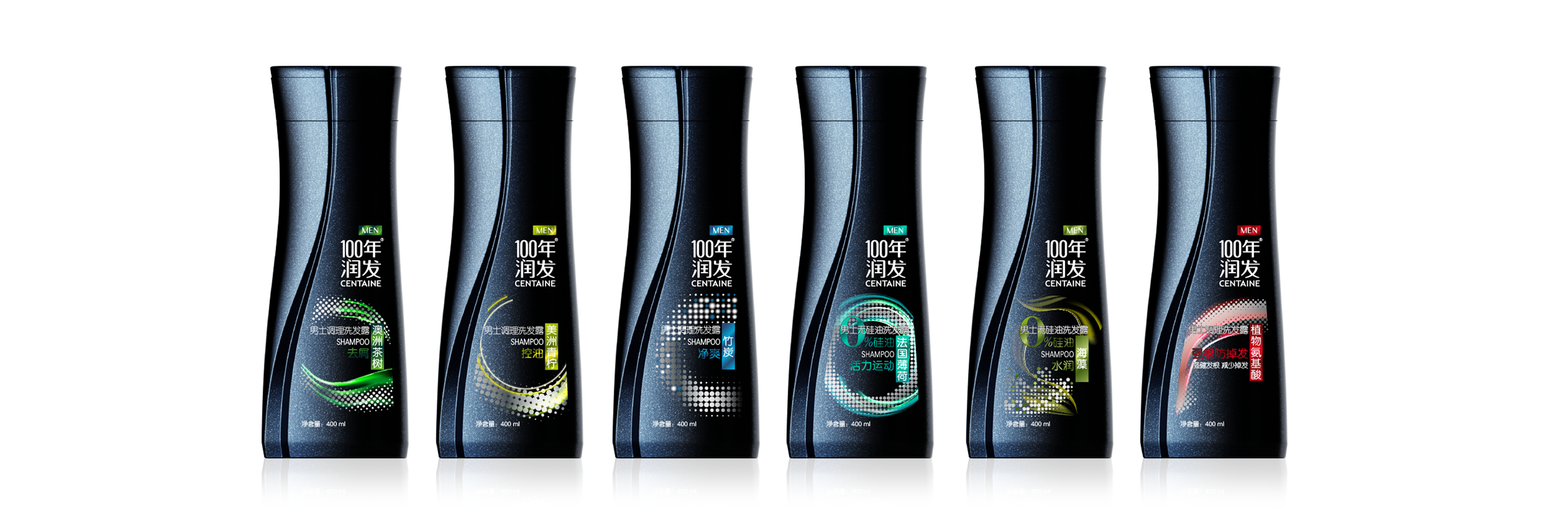
No Silicone Range

Market:
Hair care products - Chinese market
Hair care products - Chinese market
Client:
Nice Group
Nice Group