
THE COMPANY AND THE CHALLENGE
The Doña Elena brand, owned and exclusively distributed by Fly Ace Corporation in the Philippines, was introduced in 1998. It was inspired by the company’s vision of providing the Filipino families with essential products from the healthy Mediterranean diet.
Today, Doña Elena is the biggest brand of Mediterranean products in the Philippines, and its Olive Oil -introduced in 2000- is the consistent number one olive oil brand in the Philippines since 2011.
Befitting this leading position, Fly Ace Corporation decided to invest in 2017 in our services to design the new and exclusive Doña Elena bottle, giving it a unique brand character.
The new bottle design should be consumer friendly and convey the brand values of a premium, high-quality, authentic, and Mediterranean product.

Doña Elena team visiting In Spirit Design head office in France.
The approach
Despite a very large experience in Asia, this project was the first we had for the Philippines market and with Fly Ace Corporation.
After an initial visit to the Philippines to meet the client, study the market, the competitors and carry out store checks, comes the time to create.
Beside to integrate the brand and the competitors, we had to consider the existing design that consumers were familiar with, consider the three glass bottle formats (250ml, 500ml and 1L), the maximum height that will fit display shelves, the size impression, the easy gripping for consumers, the constraints from the filling lines and logistics, the material weight and cost,…
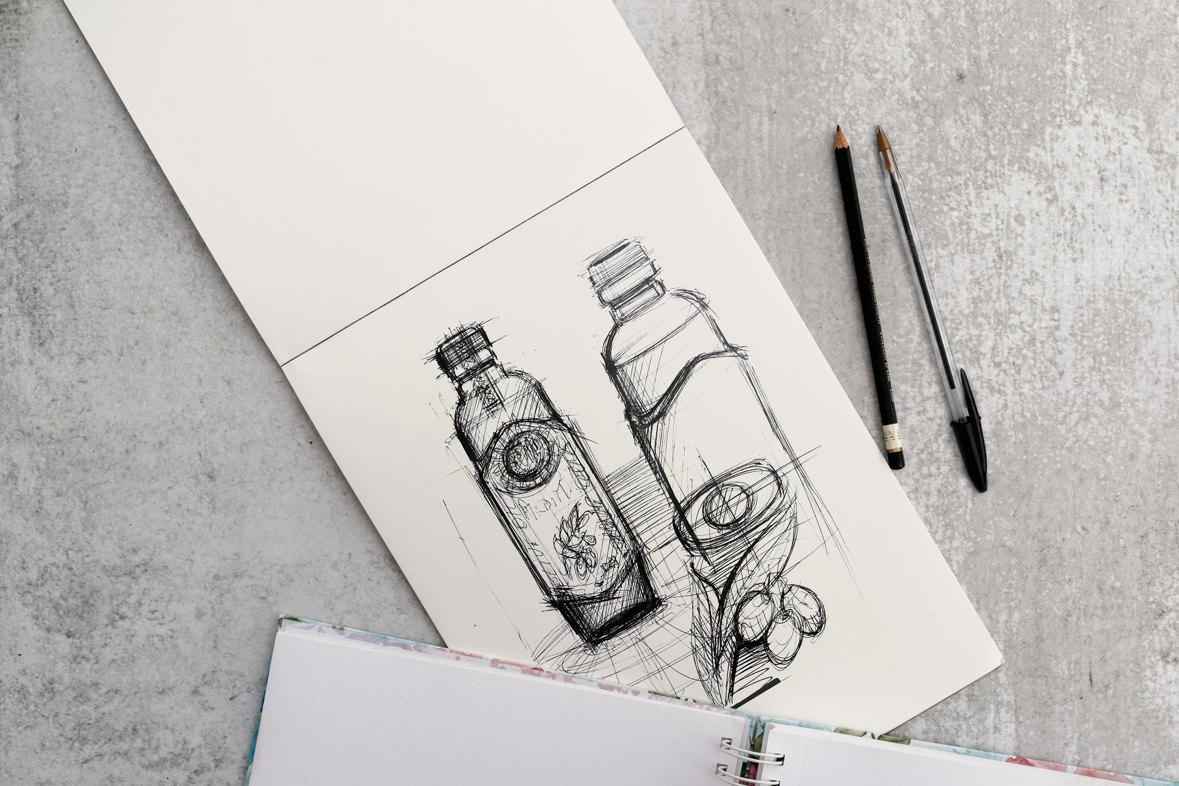
Then, to guide our creativity, atmospheres have been defined with the Mediterranean as the main theme.
We drew our inspiration from the evocative elements of this region such as architecture, terroir (amphora, pot...), oil (nuances and textures), olive trees and its wonderful fruit, the olive.
All these elements have significantly influenced the shapes of the proposed designs.
We drew our inspiration from the evocative elements of this region such as architecture, terroir (amphora, pot...), oil (nuances and textures), olive trees and its wonderful fruit, the olive.
All these elements have significantly influenced the shapes of the proposed designs.
Regarding the graphic design, we couldn’t revolutionize the logo -as it was a key Doña Elena asset- nor the label design itself to avoid confusion among consumers. However, a lifting or enhancement was necessary to bring a better balance, more modernity, and more clarity in terms of usage recommendation per oil variant.
Before
After
The result
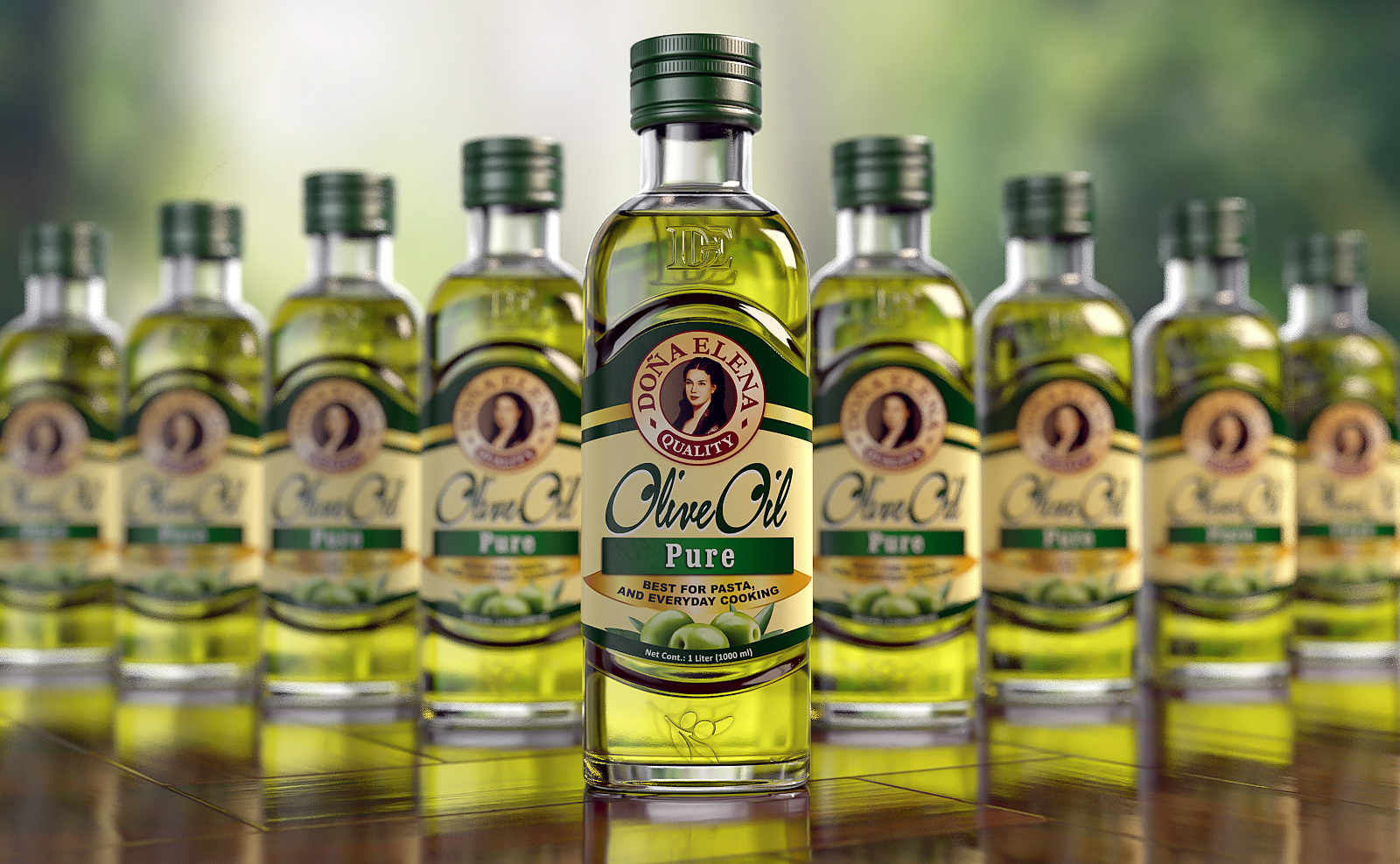
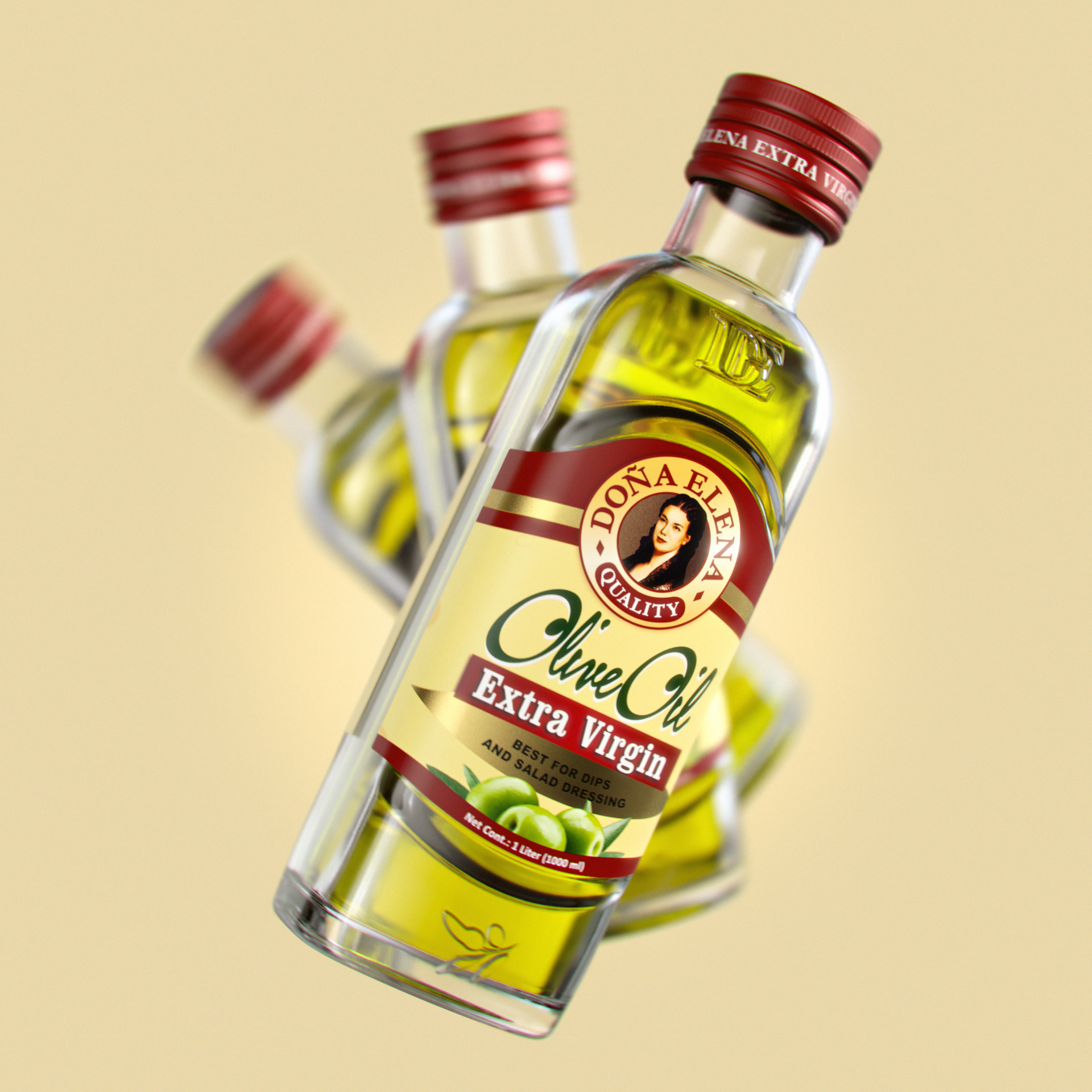
In the words of our client, this project resulted in 'elegantly designed, expertly crafted, easy to hold bottles'.
To stand out from the competitors, we ovalized the shape, which allowed us to gain bottle height as well as space for the label, achieving more impact on the shelves.
We also gave to the bottle an elegant neck and shoulders, through soft but firm lines. The roundness of the bottle makes it soft and pleasant in the hand.
The Doña Elena insignia is engraved on the bottle chest like a pendant, giving a prestigious character.
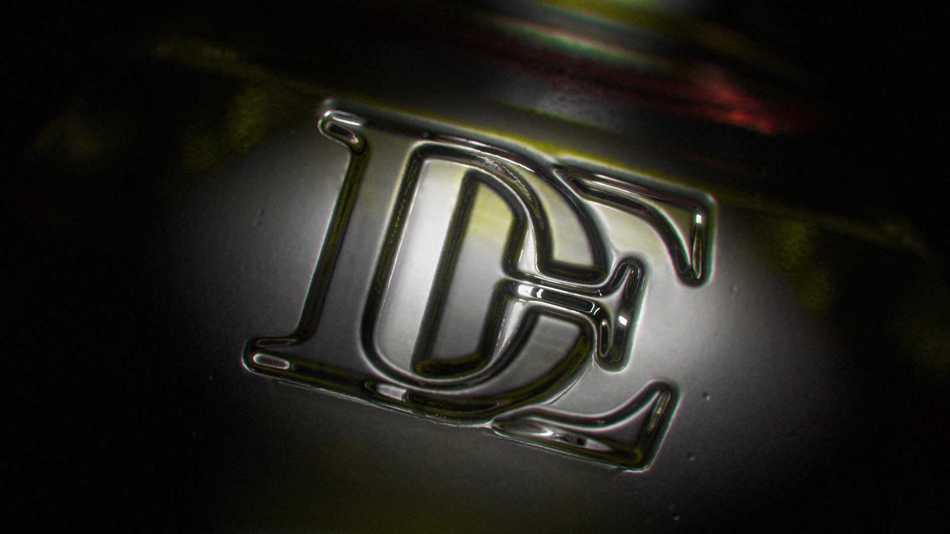
Olive oil is a precious gift from nature, shining like jewels, also good for health and with a flavor that transports to wonderful landscapes. Like a reflection of the DE acronym appear the olive fruits engraved in the bottom part, symbolizing purity and authenticity
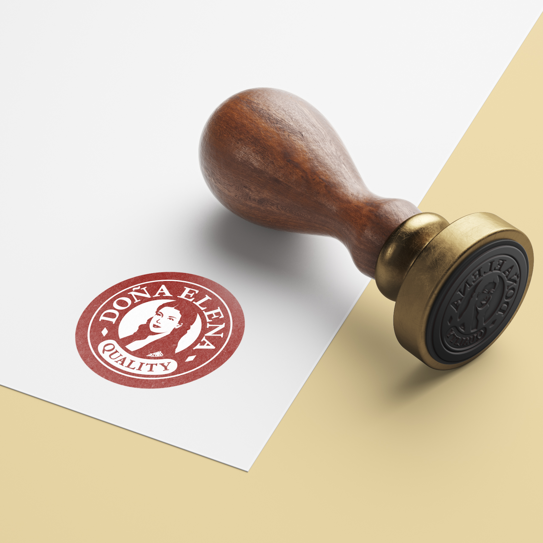
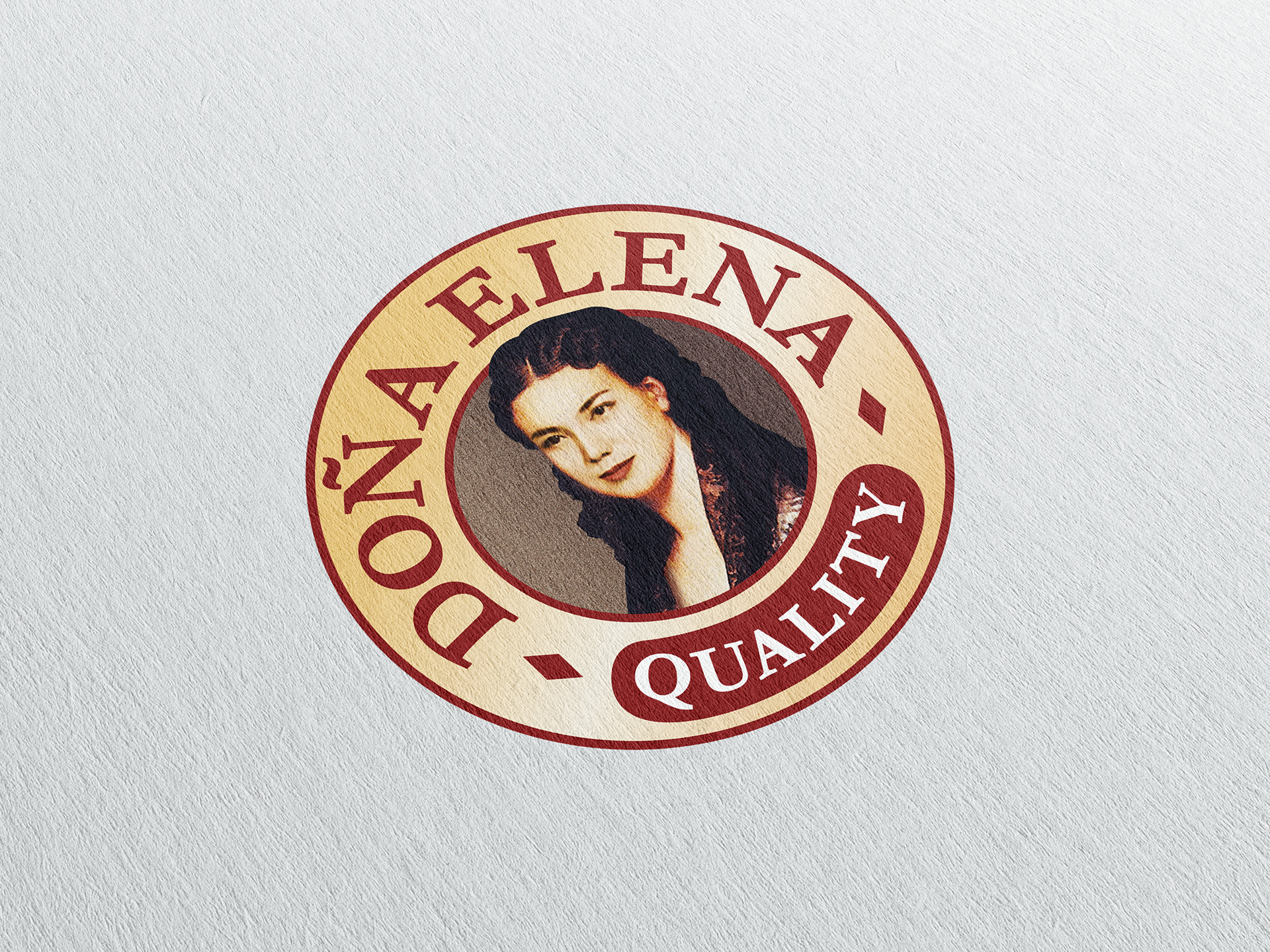
The lifting of the logo (including letterspacing, colors, typography...) has freed Doña Elena ; by simply getting her out of the frame, we made her closer, more welcoming while keeping her touch of mystery and legend.
She now looks more alive, confident, and active.
She now looks more alive, confident, and active.
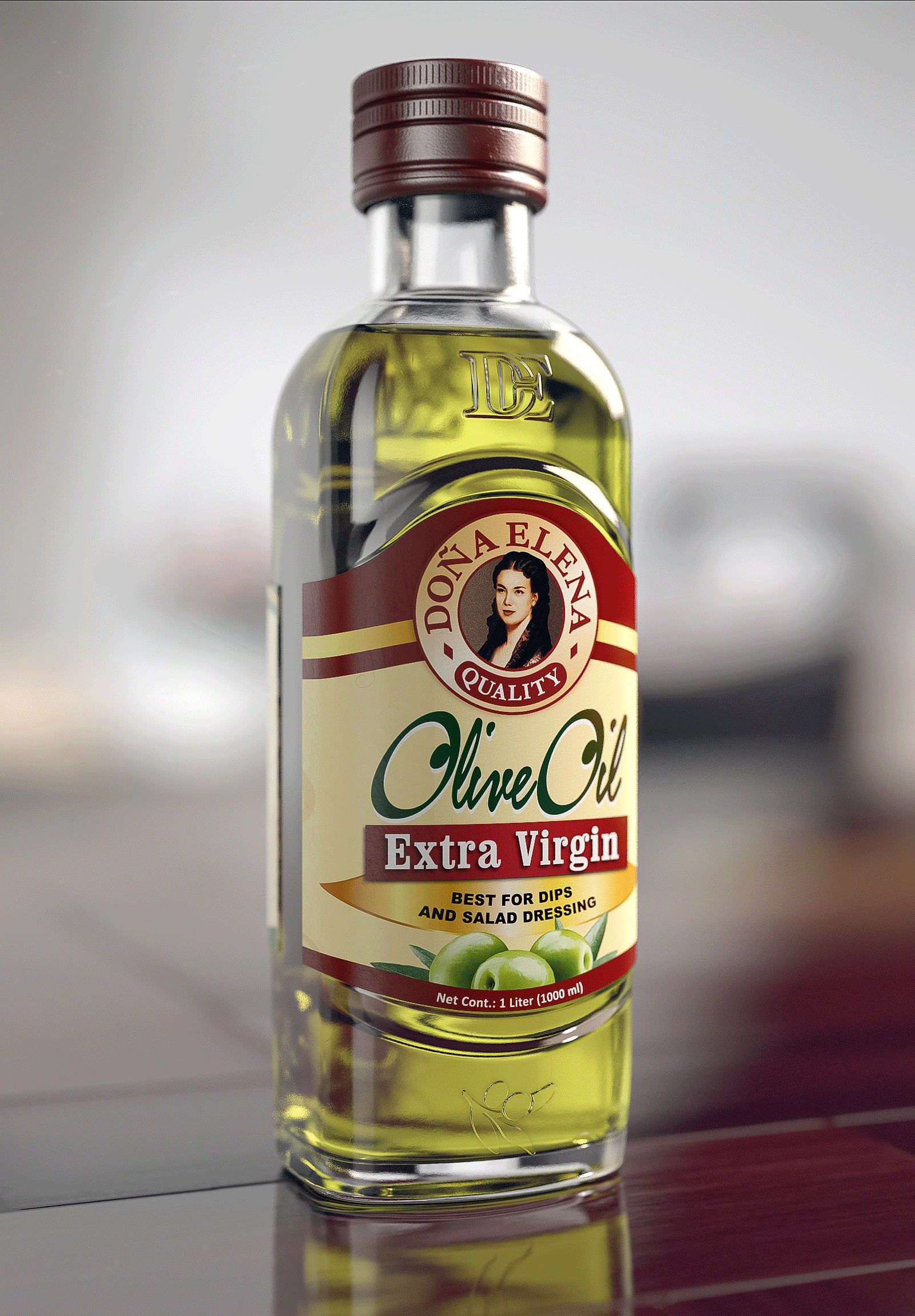
The curves of the label are in line with those of the shape and allow to highlight the logo in a privileged place on the top of the label. It now appears as a quality seal.
Finally, the enhanced labels retain the heritage look to maintain consumer familiarity but have won in simplicity and clarity; a vibrant color palette allows to differentiate each variant, the background is more minimal, and the type of oil and recommended usage take center stage.