
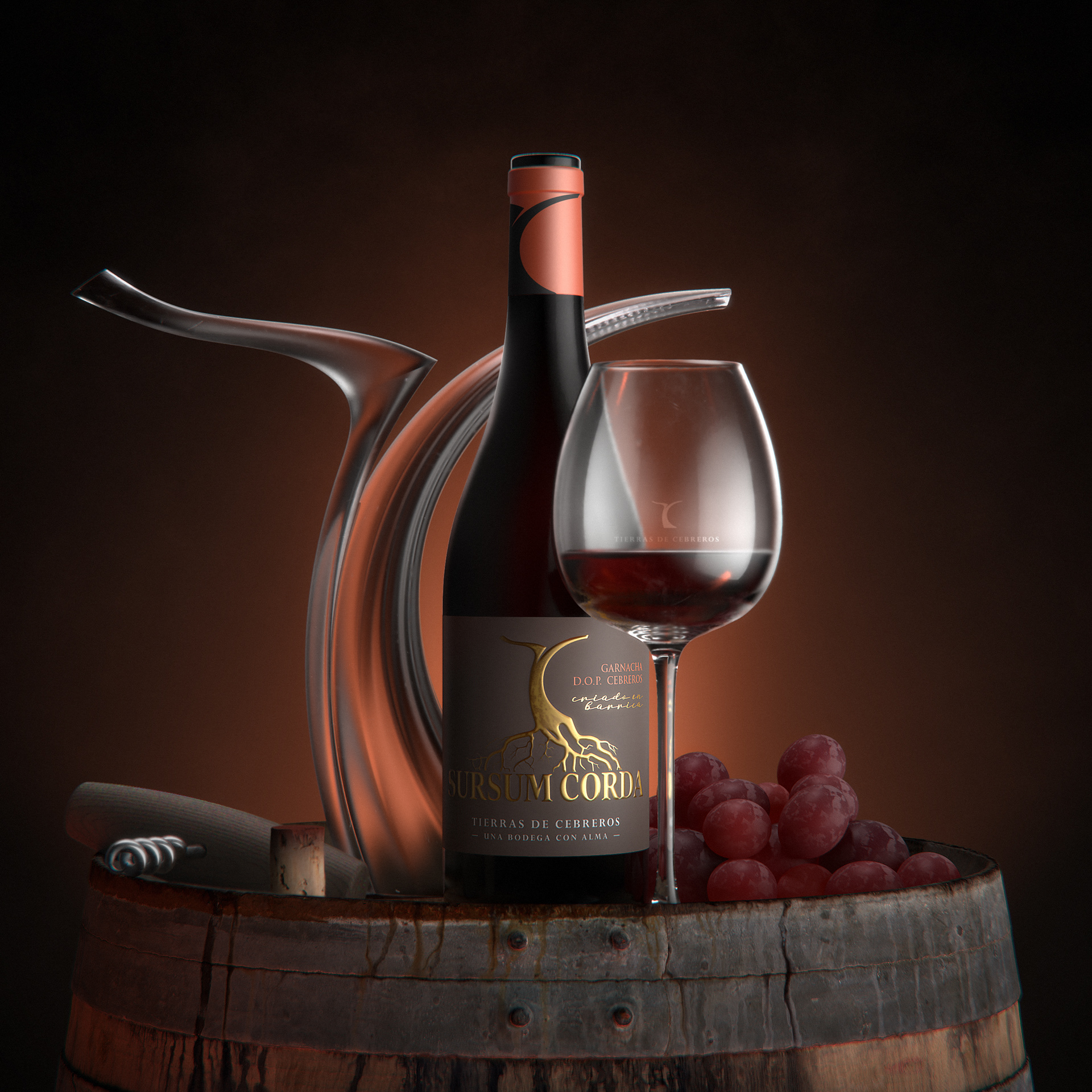
We created the storytelling and visual identity for the new Spanish wine brand, named Tierras de Cebreros (D.O.Cebreros). For this project, we combined graphic and volumetric arts, involving graphic designers, 3D sculptors and motion designers.
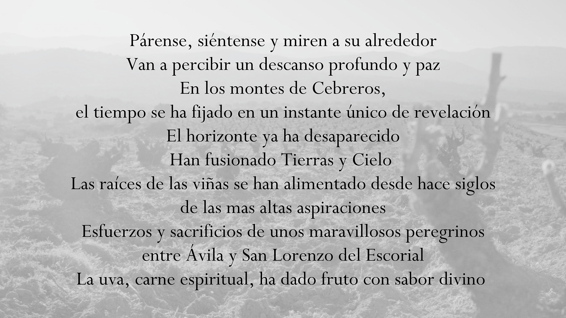
The ambition of the owner, born in the Ávila region, is to revive Cebreros deserted lands and ancestral know-how by aiming to make it a place and a wine to transmit his knowledge.
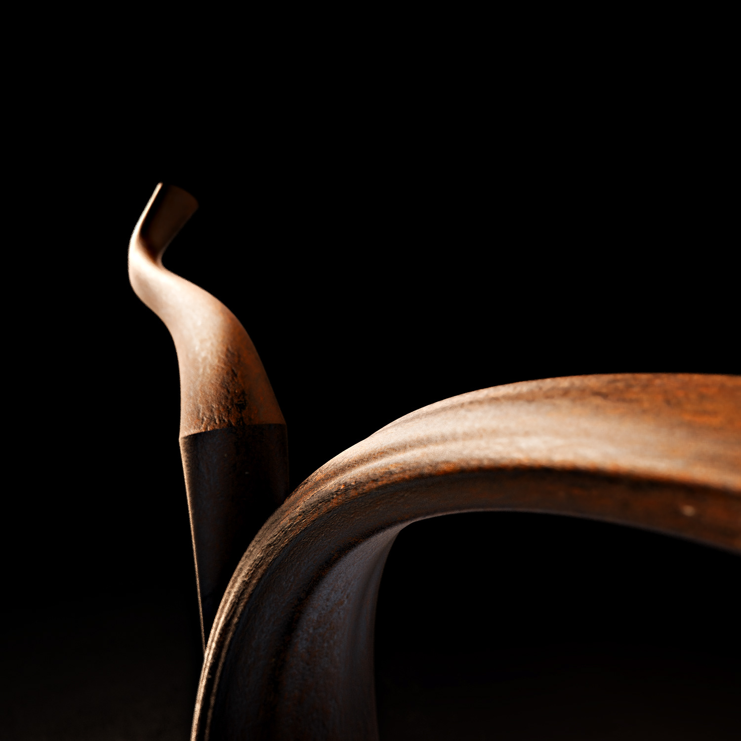
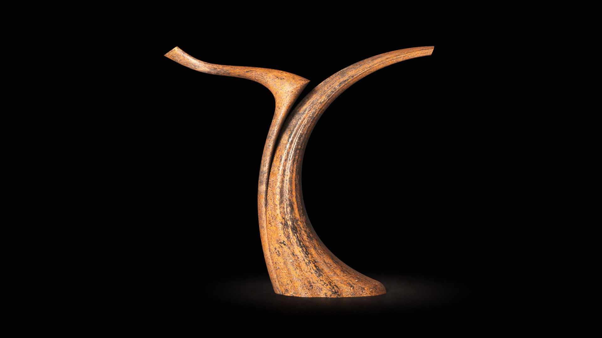
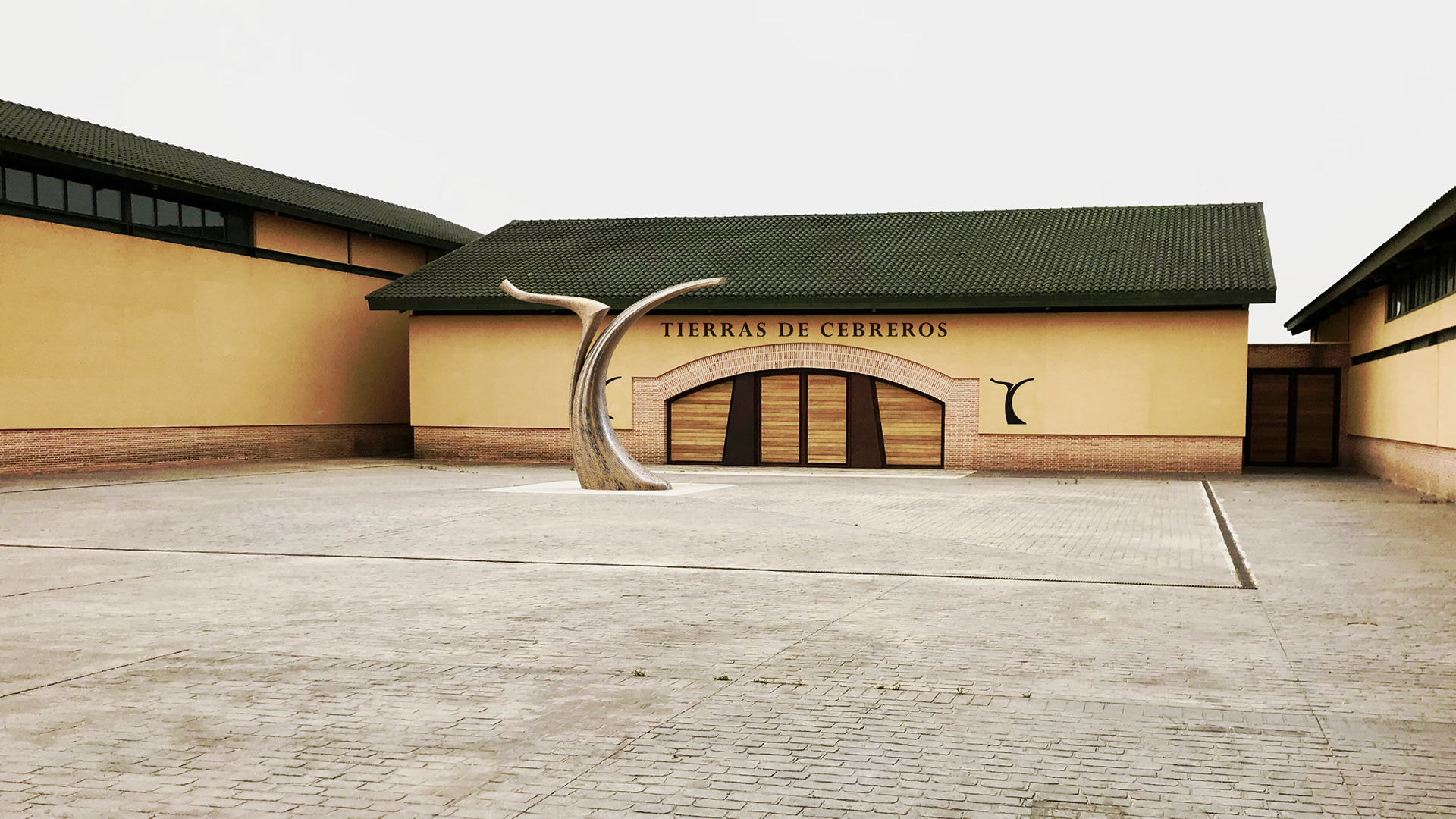
Why a sculpture to embody the logo?
These mountainous lands were crossed for centuries by pilgrims who perpetuated an ancestral know-how. The wine from this outstanding terroir is therefore the fruit of hard work. We wanted to embody this noble work with a sculpture, the artist and craftsman’s expression.
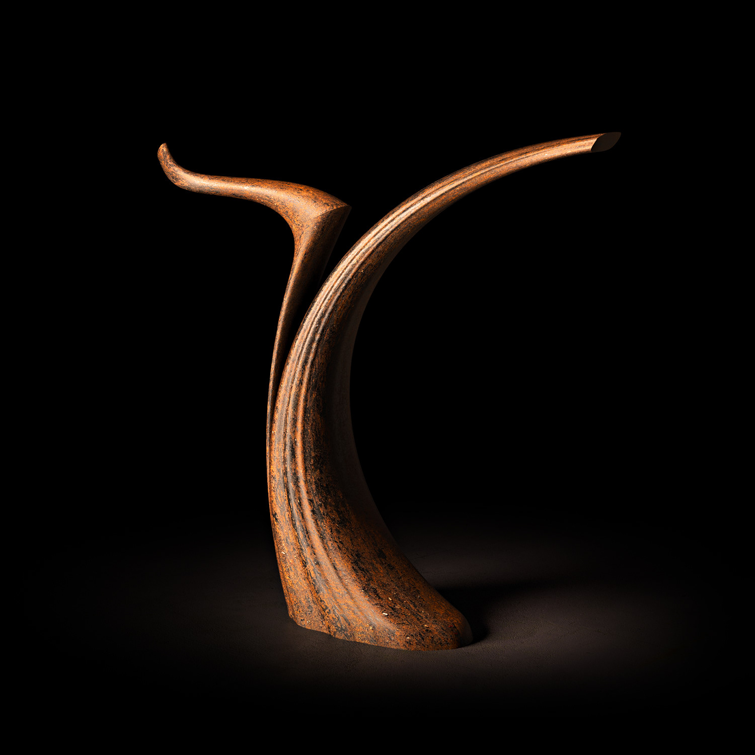
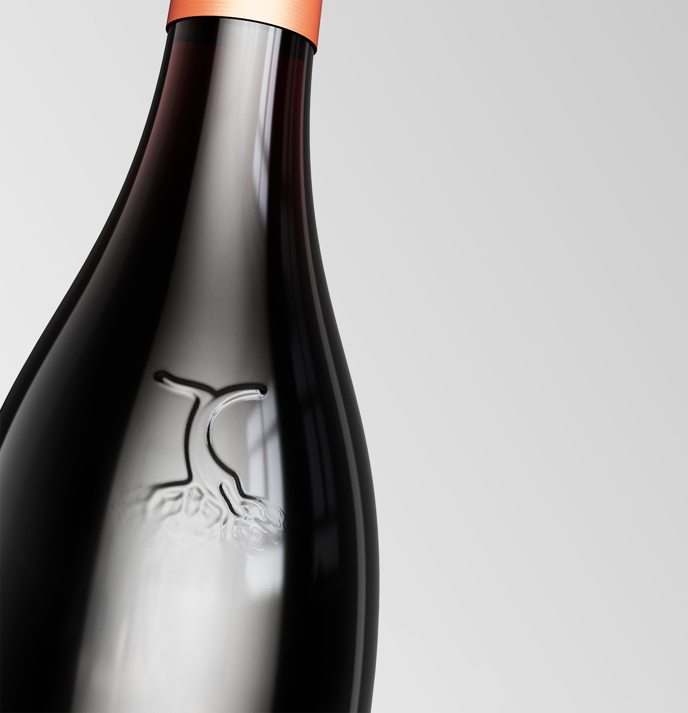
This design refocuses on the heart of the brand: the vine.
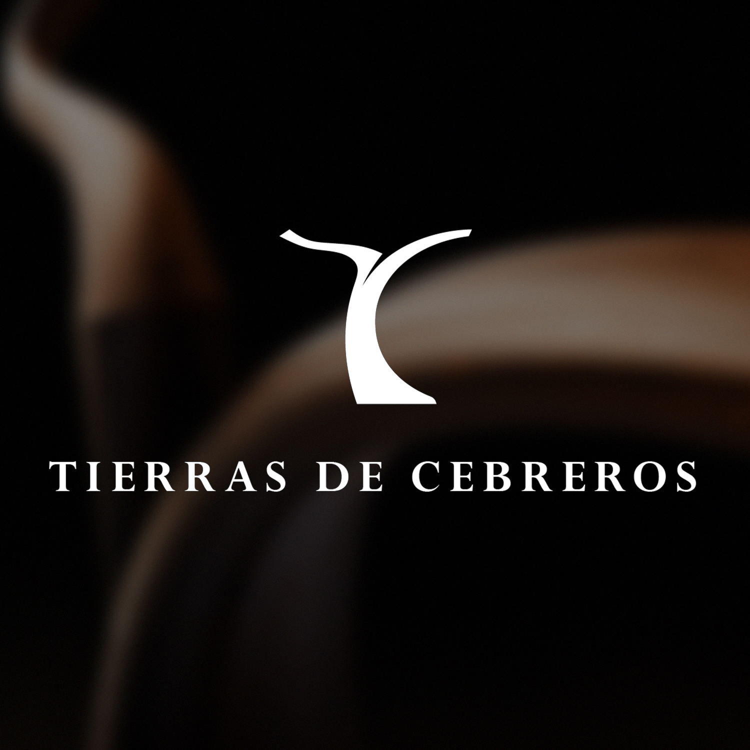
A return to the essentials with the “T” and “C” initials carved like a vine foot, expressing the strong anchorage to the vineyard and its mystical and spiritual land…
The brand blossoms in its environment and lives with it.
A return to the essentials with the “T” and “C” initials carved like a vine foot, expressing the strong anchorage to the vineyard and its mystical and spiritual land…
The brand blossoms in its environment and lives with it.
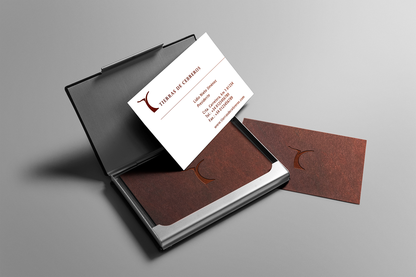
Here, some brand's applications:
Market:
Wines - Spanish & International market
Wines - Spanish & International market
Client:
Tierras de Cebreros
Tierras de Cebreros